We build products every day; how many of them are easy to use?
Brilliant technology badly designed can kill people. We make assumptions as to how simple a task is to complete, but we don’t think about other people’s point of view. What if they didn’t understand the instructions? What happens when someone doesn’t know where to click? What if they don’t know the meaning of a word?
We need to think about the user’s journey. How will they use our product? Do they need to know anything before using it? What do they need to know after using it? We need to be considerate of their experience.
In this talk Scott Berkun tells entertaining stories that demonstrate the importance and value of design and how you can go about embedding design into your products.
Slides
Want more of these insightful talks?
At BoS we run events and publish highly-valued content for anyone building, running, or scaling a SaaS or software business.
Sign up for a weekly dose of latest actionable and useful content.
Unsubscribe any time. We will never sell your email address. It is yours.
Transcript
Scott Berkun: I’m so sorry for being late, I have a new story to share as part of my talk now an extra story I can include now in my tales of woe about product ease of use. I cannot blame you at all, again, apologies. But I’m here now. And I’m ready and excited to tell some stories.
Mark Littlewood: Let’s, let’s tell some stories. I’m so looking forward to this. Welcome.
Scott Berkun: Okay, so the title, my session here is germane to the experience I’ve had for the last 15 minutes, which I’ll share for you, maybe during q&a. But the title of my session here is a possibly provocative question.
“Is your product as easy to use as you think?”
Now, I have to admit that if the answer to this question is yes, then my presentation will be very short. So that is not the answer that I’m going to work with, I’m going to work with a different answer. And that answer is no.
I know some of you probably care a lot about ease of use, and you’ve invested some of your resources in your company, to try to figure out how to make your product as good as possible. So I don’t want to offend any of you. So the stories I’m going to tell if that’s part of your ambition and mission is to make great products for people, then you’ll be all on board, you’ll you’ll like these stories, and they’ll resonate with you and inspire you to go further. For the rest of you who are in the questionable category. Maybe you don’t really know what heuristics are, you don’t really have a mechanised, systematic way to think about ease of use, then these stories will help you on a daily basis and help you with your team and your organisation to think far more clearly about ease of use, and what that should really mean for your company and for your business. So I’m going to switch over and show you my laser light show for my presentation. All right, fantastic.
So as I mentioned, the answer the question is no. Possibly No, with a question mark.
Hammer Time!
Now the first story I want to tell you, is reflected back in popular media today, it ties together with one of the most heroic stories in film of this age. It involves a hammer.
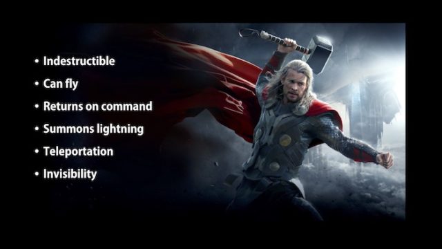
So Mjolnir is the hammer that’s used by Thor, for those of you who have seen any of the 50 or so Avenger movies, you should know who Thor is. And for us as builders and makers of stuff. That hammer is a pretty cool technological device. It has a lot of things, there’s a lot of powers that we wish we could put into the things that we make. It has features, if we were thinking from a product perspective, and its features like the fact that it’s indestructible, it’s good for the environment, then you never need to replace it has infinite battery life, it returns on command, it can summon lightning from the sky to attack your enemies. If you read the comic books, you also know has the ability to teleport you to make you invisible, all sorts of amazing powers. And if we’re thinking about the design of products, technological products, these are the kinds of things we get excited about as makers. We want to work on what’s interesting, we want to work on things that are at the cutting edge of what’s possible. So we as makers have a certain kind of bias towards things that we find cool things that we think are interesting. And the presumption there is that the same interests that we have, tie or line up with the same interests that the people who use our products have. And that’s the kind of bias that we all as makers and builders have.
So the first lesson is that we really do think differently about the world than most of the people that use our products. If we think about a regular hammer, in contrast to Thor’s hammer, a regular hammer $20 hammer you can buy at Home Depot or Lowe’s. Has a comfort grip on it, you know, easy to hold, good for putting in nails. We look at this, even though it’s probably the most popular kind of hammer, it solves the most problems for most people. It’s the simplest to use of most hammers. In our domain, as makers and builders and technologists, we’re kind of bored by this.
We look at this and go “Well, this is not that interesting. I don’t get excited about that my engineering team doesn’t get excited about that.” So that bias has to affect us and how we look at the world. Now it turns out of course, if you think widely about technological creation, and the making of software, there’s an infinite number of kinds of hammers you can make. There’s an infinite number of kinds of software you can make. Infinite.
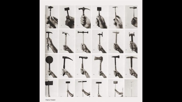
And we fall into the trap usually, though, of ascribing the value or quality of a made thing to the thing. But this picture here, this wonderful photograph, made by the artist Hans Holan, was trying to demonstrate how design is really about context and the upper left hand corner you’ll see this tiny little hammer. It’s something you would use if you were an artist, refining the tiny little details and making a sculpture. And then in the lower right hand corner, you have these enormous sledge hammers that require both arms and strong shoulders, and are meant to do as much damage to a building you’re trying to take apart as possible. So those are on the opposite ends of the spectrum of what’s possible for a hammer.
So which one is good? What’s a good hammer?
It depends on the context, we really can’t say the hammer is good or bad unless we know what it’s going to be used for. And this works against our builder maker instincts. It also works against culture, because we tend to compress down the design of the thing and the problem altogether. So it’s common for us to say things like, that’s a good couch, or I love that movie, or these sneakers are great. It implies a context that is important to us. And that’s why we think the thing is good.
That sets up a trap that allows us to ascribe the value to the thing, even though the context is what matters. So you can take the hammer in the upper left hand corner, designed for making art designed for making something really detailed and precise. If you gave that to someone on a construction site, who is doing demolition, and replace it with their sledgehammer, it would be a terrible hammer. It’d be the worst hammer they had ever used.
Why? Because the context is different.
So that means that these questions that we often throw around in our industry, and now even in just regular normal culture don’t have much value. It means that they become dangerous phrases. We use the word intuitive a lot, oh, we need to make it intuitive. But the problem is that the word intuitive is not something in the object. Intuitive means familiar. So it means depending on who it’s for, it will be intuitive for them or not, it requires a lot more work.
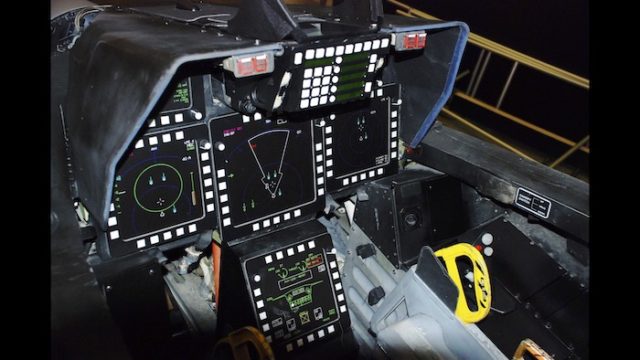
Take, for example, the user interface for a fighter aircraft. Now, you might look at this and ask the question ‘is it intuitive?’ We go, No, there’s too many buttons. It’s complicated. But in the context, if you’re a fighter pilot, who’s trained to be a fighter pilot for years, and has studied and practised in this aircraft, this could be the optimal, most intuitive user friendly design for that fighter pilot. It could also be the worst possible design for a 10 year old boy who wants to play a video game on his Xbox that just has a little, you know, one thumb button for this one thumb button for that none of this complexity, it really depends on the context.
And even further to this point, think of something as simple as a menu at a restaurant. If I handed you a menu at a restaurant, it’s all in one language. If you know how to speak that language, it could be very intuitive to you. But if you don’t speak that language, it’s completely incomprehensible. But the menu itself has not changed, only the context has changed. So instead of all these phrases, we really need to come to a better understanding of what good is a better understanding of what easy to use means. And to catch ourselves when we fall into the trap of compressing all this down, and believing it’s an artefact of the object itself. It’s not. So your first step is, whenever you use these terms, if you put it into your requirements, documentation, you put it as a project goal, you put it on your roadmap, ‘We’re going to make an intuitive widget for our customers’, you have to say wait, that needs an asterix. If we don’t know what intuitive means, maybe we can try to sort that out and research that and develop that. But we really don’t know. And if we use our own judgement for what’s intuitive, we’re going to fall into that builder bias trap of building stuff that satisfies what we can do.
Four Questions of Design
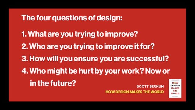
Now, the book, ‘How Design Makes the World’ all these stories and examples come from the book, the book is anchored on four questions. And that’s going to be the thrust of my my time with you.
The first question is, ‘What are you trying to improve?’
And these questions are meant to be something that compress down a lot of knowledge about good design into one simple list that you can reuse, you can put it in a tweet, you can put it in a presentation, put at the beginning of a specification, an easy way to come back and revisit these, these constraints. And these better ways of thinking about design. So the first question is, what are you trying to improve? Or what problem you’re trying to solve?
The second question is ‘Who you try to improve it for?’
And until you’ve done work, thoughtful work, removing the bias and our own preferences. In answering these questions, you’re probably setting yourself up to fail and make something that’s much harder to use than you want. So in the case of tasks, what are we trying to improve? Instead of looking at the list of all the features that Thor’s hammer has, a better question to ask is, what do we try to improve? What are we trying to make better? What’s the scenario, this will be used in? Let’s be clear on why someone’s going to buy this and what they want to solve in their life with this. We’re trying to help them hang a painting on the wall, which would suggest the $20 Home Depot model, that that design approach is really good, or we’re trying to win the battle against you know, evil forces in this fictional universe, in which case, Thor’s hammer is way better. So it’s the context, you have to really go deep into the context. The problem is as builders and makers and as engineers, context is kind of a drag, we want to get into start writing code want to build stuff, we want to make stuff. So the most common trap that engineers and people who have an engineering mindset have is wanting to run right past all this thinking, and just start building under the presumption that we’re really good at knowing what the problem is, what the tasks are, and who we’re designing for. So we have bias, it’s hard to unpack all the different biases that we have. But that’s the beginning of good design, is recognising how big that gap is, and that your work is in investing there. Now bias goes even further into extreme cases where we are really totally blind to the consequences of the design choices that we make, and how that affects not only our business, but the impact of who is even allowed to participate and be a customer. So there’s this story. Well, before I tell that story, so
If you think of the proficiency bell curve of all the people who use your product, all of them, so the whole, you have 1,000 customers a million customers, there’s some bell curve of how proficient they are with your, with your software right now. And on one hand are all the people who maybe have just bought the product, or they’ve never used it before, but they’re thinking about it. And on the right are the super power users, the people who really know the product better than anybody else. And so to recognise our buyers, we have to know that you and for your power user and this example, are all the way on the extreme end of the chart, way out of the representation of your user base in terms of how much of the functionality they understand in terms of their general technological savvy, in terms of the amount of time they’ve spent using the product, you are way at the extreme end. So that means that there’s this normal part of the curve, the majority of your users, the base of your business, they’re all people who know less than you do. That’s 40%, or 50%, of your user base knows less than you do.
So unless you unpack your biases, you’re going to be designing over their heads, you’re going to tend to put in more features and more things than they’re ever really going to use. And then if you think even further to the left, the 10 to 20%, who know the least, it’s very easy to leave them behind they’re not likely to be as vocal, they’re not likely to be as active and complaining and asking for things because they don’t know enough necessarily to know what to ask for. But the future growth for your business has to be moving these people from being novice users into being more common users more normalised users who are getting more value out of the product and are more loyal to it. So most of your investments then have to be what’s going to feel like beneath the curve for you, it’s gonna feel boring for Thor, it’s gonna feel boring for you as a user, but that’s where the majority of progress is going to be.
And then of course, there are these blind spots that exclude people from ever even possibly participating in using your product. Why? Because we tend to design for ourselves. So there is a story. That’s an alarming story. From just a few years ago, Carol Riley was a researcher, she was working on voice recognition for robotics. And she was using a toolkit that was made by Microsoft. Now, this toolkit, it wasn’t a product that they sold, but it was an available toolkit she was using for her research. But the research that she did in developing this new voice recognition system, she actually couldn’t demo it herself. And the reason why she couldn’t demo it herself was that the team of people that made it we’re all male engineers, they’re all men. So the data sample that they use, just because it was the cheapest and easiest data sample to use, right? The most convenient data you have is data from yourself. They use their own voices as the samples.
So in order for her to demo her work, she had to have a man do it. Now that sounds like wow, that’s really embarrassing. It’s just kind of dumb, like why wouldn’t I have a wider dataset. But this is our biases, we tend not to think about people who are different from us. And that runs all the way up and down. Now, I offer this maybe primarily from an ethical and moral standpoint, that we’re excluding people from getting access to technology. But there’s obviously a business connection to that too. You’re excluding possible customers, by limiting your data set based on the assumption that we are representative of who we are designing for.
Want more of these insightful talks?
At BoS we run events and publish highly-valued content for anyone building, running, or scaling a SaaS or software business.
Sign up for a weekly dose of latest actionable and useful content.
Unsubscribe any time. We will never sell your email address. It is yours.
From Marvel to Cathedrals
Now, the story, a story from the real world to escape from the Marvel Universe for another minute, has to do with the fire from the Notre Dame Cathedral that happened just about two years ago.
And that fire was an example of what I am talking about where the builders made the mistake of presuming to know who was going to use it. Now I’m talking specifically about the builders of the fire alarm system. They still don’t know what caused the fire. But we do know a lot about the design of the fire alarm system. They spent millions of dollars over many years to develop the system. They had requirements documents, they followed a lot of standard engineering practice, requirements, modelling and all the system engineering. It was an impressive effort that they put together the best experts in the world on designing fire systems for antique buildings. Now, this building is precious, it’s one of the most popular buildings in the world, they invested all that money to protect the building. But the task, the scenario we’re designing for here is not just to detect the fire, the user scenario is can the person who is manning the security station where the fire alarm system will go understand it enough to do anything about the fire. That’s where the system failed. So they designed the system really well. It kept the building safe, some of these systems can damage the building itself, because they’re so old, they avoided that problem.
And the day the fire happened, this alarm went off in the security room that said this: ZDA1103/15/1.
That should mean nothing to you. The problem is it meant nothing as best we understand to the security guards. It meant nothing. What was it?
This is a specific sensor in that fire alarm system. It indicates an exact location for where a fire was detected. So the engineers knew what this meant. The builders knew what it meant. All the requirements, documents, millions of dollars spent on the system. This is what the requirements said to put there. But on that day, the security guard who was working, had only been working for a couple of weeks, was working a double shift because someone didn’t show up. He saw this alarm. And there was a second note that came with it that said ‘attic nave sacristy’ and a sacristy is a kind of store room in a cathedral. So what did the security guard do? He went from the security room to what he thought the location of the fire was the sacristy. He walked outside, went to the sacristy building, and looked around. There’s no fire. So he got on the walkie talkie, hey, there’s no fire here. A ridiculous conversation took place between him and the other security guards. They realised he was in the wrong sacristy. There were two sacristrys in this building. Eventually, he went upstairs, the attic sacristy and that’s where the fire was. Now, all of this time, 25 minutes about went by the fire was now an inferno. And there was no way they could put it out, not in any reasonable way. So it’s that gap between the builders view of the world. And the reality of who the customer is, what they know, what we can assume about them and what their scenario is that gap is why this building may never recover.
Is it a technological failure? No, the technology worked. To me it’s a design failure.
It’s about the difference between thinking about the technology, and what the actual user experience of the thing is going to be. And as builders, people who are makers, we like to build and make we’re technologists. So we will always start by building stuff first. In the case of the Notre Dame fire, they never ever got around to ask these questions about the user experience. Some projects do it and they do it at the end. But by then it’s usually too late to make the fundamental changes required to make something that actually would have been easy to use.
There’s another story has a similar trajectory to it. And I’m not going to tell you, I’m going to see if you guys can guess you folks can guess what the project was.
But these were things that were said by luminaries at the time that the project was demoed. Steve Jobs thought that this new invention was going to be as big and as important as the personal computer. Jeff Bezos thought it was going to be so revolutionary that it would it would sell ridiculously well. And John Doerr who was one of the early investors in Netscape, luminary VC person, he thought that it could be so important to the future of the world that it be more important than the internet. So let’s see if you can guess. So I got someone who says Apple Newton. That is wrong. Although the timeline Apple Newton is actually a little bit earlier, I think. Segway Yes. Yeah, Ray got it. Correct. It is the Segway. The Segway. For those of you who may not know what it is, I think most of you probably do.
The story of the Segway is similar to the story of the Notre Dame Cathedral. You had this technology that was built and understood. It actually solved the problem. Dean Kaman is a notable inventor. He invented many devices for the medical community for helping people with disabilities, but they started the project with the goal. Let’s take this technology we have and find another use for it. And he decided pretty much on his own, that the future of this device would be to revolutionise transportation and replace the car. That’s what he said he claimed this would be as important, this would be the equivalent as the horse was to the car, the car is going to move to the Segway. Now they had the technology, they had a demo that impressed these technological luminaries. But what they didn’t do was actually go and study people, and what their needs were for transportation. They didn’t ask the question, what do people who currently have cars? What are their complaints? What problem do they want to solve? How would this new idea be better for their needs than the car is? They really never even asked that question. They didn’t think through the logistics of how highways and sidewalks and all the other parts of infrastructure and the design of the world would have to change for the segway to be successful. But they managed to get support because technologically, this was interesting to builders, again, like Thor’s hammer, this was really attractive, it seemed really cool, had all these gadgets and gyroscopes.
So we were turned on to it. But that’s disconnected from the majority of the world majority of people, the majority of consumers, the majority of possible customers, the invention does have merit. It has niche uses for, as you see here for tourism and for security. But it never ever approximated anything like the success of what was predicted. Why, because they were detached from actually understanding people, they knew their technology really well. But they diminished and dismissed the need to really understand who they were designing for.
Want more of these insightful talks?
At BoS we run events and publish highly-valued content for anyone building, running, or scaling a SaaS or software business.
Sign up for a weekly dose of latest actionable and useful content.
Unsubscribe any time. We will never sell your email address. It is yours.
Building vs Designing.
Now, I refer to this as the difference between building and designing.
Now, building is hard. building things is difficult. Most of my career was spent as a project manager, working on big engineering projects, it’s hard to build something, it’s hard to finish on time. It’s hard to, you know, meet your budget, it’s hard to come up with requirements, it’s all hard. I’m not saying it’s easy. But you can do all that and end up with the Notre Dame fire system. You can do all this and end up with the segue in order to do better to really solve problems for people you have to be designing. And by that I mean, you’re asking questions that are a little a little fuzzier, take a little more thought. They’re a little further removed from your favourite Development Language or your favourite business model. You have to be figuring out what is really the right problem to, study people and learn, how are they actually working? How are they actually using this thing that we’ve made, you want to solve the not only the right problem itself in the right way for the right people. And so product roadmaps come up all the time in business culture around technology. But that’s still your view of how you want the world to be. There’s a rough equivalent, that’s from the customer perspective, that’s called the user journey map. And to create that you have to talk to customers and understand their needs and problems. And then you can ‘ah, that’s what that’s what they need. It’s what they want. How do I make the roadmap and the user journey map, those things line up together?’ That’s what you’re hoping for.
So there are ways there are tools and methods, some of them a very inexpensive and easy to do that allows you to start from the user experience first or early before you’re committed to making some of these mistakes, that will help you make better products have happier customers and have have a better business. So study your customer. First, what does that mean? There’s questions you want to try to answer that are aligned to certain tasks that people who are called user experience designers can do. User Experience, designer means someone who’s good just to go back, someone who’s good at thinking about that user experience, even if no technology exists yet. They have methods and techniques they can use to prototype and do research and talk to customers and understand them that develops that understanding, and allows that to fuel and be planted as seeds into the entire development process. So some of those techniques you may have heard of, maybe you even use some of these things. But the problem with just doing these techniques. The problem with having a founder of a company, or the director of engineering, or programmer employing these techniques is that we have that bias. We’re biassed towards building. It’s very easy to do a customer interview, where you show them something and say, Hey, do you like this? Most people are polite, they’re going to tend to say yeah, it’s great, I would totally buy. they’re unlikely to confront you and a user interview. So there’s a certain kind of skill and knowledge to use these methods to actually get you valuable data that you can use.
One simple trick…
Now the one method I want to briefly talk to you about the most because the title the title of this talk is, ‘Is your product easy to use?’ That’s very specific. Can someone with a certain task go from A to B to C to D to finish and be happy? And a usability study is the specific technique that’s best at answering that question. Now usability study means something very specific. It means you observe an actual customer, an actual customer trying to solve an actual task or solve an actual problem they have with your software. And you just observe, you just watch and take notes. You’re not allowed to help them. You’re not allowed to say, Oh, if you just click here, you can’t do any of that. Why? Because any person who actually buys your product, you’re not going to be sitting there giving them help. You want to observe the truth and the reality of it. Now, a lot of people don’t do this, because it seems so odd. You say, Well, we have instrumentation data, we know where they click on our website, you get some information from that. But you don’t get the why you don’t understand what were they thinking that led them down that path. And that’s as a designer, as a creator. That’s what you want to know, oh, from this screen that made them think they could go that way. But really, the truth was, they had to go this other way. Ah, we have to redesign, that kind of insight can only come from observation. And so a usability study can be really lightweight and simple.
As long as you’re actually observing people, you do have to give them tasks that represent the reality of what they’re going to do. You can have bias there, too, you give them a task that you want to observe, but the way you’ve written the task, kind of tells them what menu to go to, or, or where to click, you have to be really careful to abstract out your knowledge and just leave their intent. And so this is an example. Video over zoom can be tricky. I have set it to optimise, we’ll see if it works.
This allows you to watch this as an example of a usability study that someone did for the Zipcar website. And the task they were given was to try to figure out, if Zipcar had stations available, near where they lived, simple task, and what you do, you can observe, you watch and you learn, what are they thinking, what are they doing? So I’m going to try to show you that video here right now.
All right, so I’m looking over here, this is written plans. I don’t want this so I’m going to go back to the top here. Join Zipcar for me how it works, find cars. Well, let me look at find cars. See if that tells me. Well, let’s see. This tells me to enter my address, to find the nearest Zipcars. Find cars by location, well, this tells me where they are. I don’t know if it tells me about availability. But maybe I’ll look okay, find cars by location, all right, enter my address, or choose my neighbourhood I’ll choose my neighbourhood let’s see they have my neighbourhood Brookline. All right, we’ll put in Brookline. And this shows me where all the zip cars are, and how many of them are available, meet the cars. Alright, so now I’m looking at a map. Which is.
So I’m gonna pause it right there. Hopefully, you’re able to watch some of that.
Now, a couple of things, you may not have noticed that you noticed.
The first thing is that watching people use your product feels incredibly slow. It always does. Why? Because again, we forget that we are in the product every day, we know all the Command keys shortcut keys.
For testing purposes, we’re in there all the time, most of your users are operating on the bell curve. They’re at a far more normal distribution, and how much it takes them to do things, how much time it takes them. And as you watch this, because you and myself, we didn’t work on the Zipcar website, it may not be all that interesting to watch, it may seem like it’s all going fine. It’s all going. It’s all going simple. It’s all going well.
But depending on your context, as the maker, you’ll watch this with a very different set of attention. Because you had a mental model in your head when you when you made the prototype. Now you’re seeing, does your mental model actually match the mental model of the real people who are doing it? And I’m here to tell you, as someone who’s done, design work and user interface work for a long time. And despite all my experience and knowledge, that’s never the case. It’s always surprising. There’s always things you’re like, Oh, I didn’t realise that this word would mean that to them.
And so if you really do want to close this gap between building and designing, you have to invite this kind of information into your process invite it into your project team. Most of the time, what it feels like, isn’t like this, where it’s Oh, it’s slow, usually it feels far more like torture. It feels more like watching someone try to drink a glass of water that you think should be something super obvious to do. But they’re they’re just utterly failing to get it done just every assumption they make is the opposite of what you’ve assumed. And so it’s pretty typical for engineers and product managers, and founders of companies that when they’re actually watching the usability study happen, it’s this hair pulling, frustrating experience.
Smarter Users Please!
Something that’s really dangerous that can happen once you start doing this kind of research is the sensibility of saying things like, we need smarter users. And to say it as a joke. That the problem is the users brain, the customer’s brain. And as a kind of gallows, humour, entertainment, that’s kind of a funny thing to say. But the reality of it is, you are projecting blame in exactly the wrong place. You’ve chosen to make this product, you’ve chosen to make a business, you’ve chosen the promise in your marketing, this will help you drink a glass, you’ll be able to be fulfilled and get hydrated through the day, you are making that promise. So if people you are designing for are failing, it’s entirely your fault. We have to own that.
That’s what it means to be a designer or to care about design, as opposed to being a builder, where you’ve made a fire alarm system that no one could understand. Did you build it? Yeah. Could the Notre Dame fire cathedral people say, in mean spirited in their own private engineering circles? We need better security guards? No, I think that’s professional incompetence. Part of their job should have been to say, Who are we designing for? What do they know? What can we assume about them, instead of presuming they would have the knowledge that they did? So one harder kind of data you get out of doing user studies is really the best actual true data to answer the question, how easy to use as your product. There are ways to measure it.
Three Metrics of Design
And it comes down to these three measures. These are the best measures.
- How much time it takes people on average, to do whatever the task is with your product? So it could be if you have an expense reporting tool, how much time on average does it take someone to fill out an expense report?
- How many errors do they make when they do that? Zero? One? Ten? Twenty?
- Success rate.
So a lot of usability studies, end in failure where someone’s given a task like find a Zipcar location, it’s capped by time, they have up to 10 minutes to do it. And they simply can’t get it done in 10 minutes. So their their success rate on that will be zero. Those are the three measures that gives you the most the strongest, most reliable, most informative data. Because if you really think about it, time on task is the greatest metric, universal metric of ease of use for anything that we have. And if you capture that data, you can collect data like this for your over time, you can see, are we making our product better? For this one task? Well, originally it took 12 seconds, now on average is down to six. There’s all sorts of questions in here that might be on your mind about well, how many people do you need to run to get that kind of data? And how predictive is it, that gets into the weeds of the details here, you could run a study like that on one person. And you’d be far more informed about making a good product than running a usability study with zero people. Two is better four is better, you can start making more claims and get more data like this. But the Zero to One is part of why I’m here. I know most organisations, especially at the size and the demographics for people who attend Business of Software, don’t do this at all. So all your all your ideas about how good your product is, in terms of ease, easy to use, are not really based on actual data from your users. Now my third question in this list these are four questions. I got two more, only about maybe seven minutes or eight minutes left, and then hopefully, we’ll still have some time for q&a. Again, I apologise for being late.
Those first two questions are easy. What are you trying to improve? Who you’re trying to prove it for?
You can, okay, we want to make hanging paintings on the wall better. And we’re trying to improve it for the average user. We’re not worried about Thor, or Captain America.
The hard part then is well, how do you ensure you’re successful? How is it when you’re working on a project and you’re distracted by engineering challenges and budget challenges? And all the hard stuff of building? How do you make sure you’re doing this well?
And there’s two answers to that.
One is iterative user-centred design, which is a fancy word. The most important part of the word here is iterative.
It’s too easy to see usability and ease of use is something you just test at the end. It’s like a pre launch check ‘are we usable?’ Yes, great, send it off. That’s the wrong model.
The right model is, I’m suggesting is you start with the people first to learn about them and you make a rough prototype, learn about how people respond to that. It should be something that’s integrated into whatever method you’re using.
Now, by and large, most engineering methods are terrible at thinking about ease of use, just terrible. Why? Because they were designed by engineers for engineers. So it’s not a surprise.
So you see now there’s all sorts of different formulations of agile I’m not going to argue about which one is better or best. But you have to be thinking where in this loop where every time we have a step in the iteration, are we doing something to verify, and check that these changes we’ve made to the requirements, the changes we’ve made to the engineering, how does that affect the user experience, you want some way to inject that data, that information back into the building process that you’re still designing, the second part has to do with power. And that’s gonna be my last story for you. In this presentation about design power, the best user experience should feel like a great movie, that all the pieces fit together, the acting, the cinematography, the scripts, the special effects, it all synthesises and feels like it was made by one person with one vision.
Want more of these insightful talks?
At BoS we run events and publish highly-valued content for anyone building, running, or scaling a SaaS or software business.
Sign up for a weekly dose of latest actionable and useful content.
Unsubscribe any time. We will never sell your email address. It is yours.
Missoula, Montana
But design often isn’t done that way. If the engineers individually are responsible for the user interfaces for each of their parts, then you have like six directors, each doing things a little bit differently from part to part. So my last story has to do with a real story for how design went wrong in a city. And you may be in a city where you have an area that looks like this, but this is literally the cityscape for Missoula, Montana. And in Missoula, Montana, the core of the city is rotated 45 degrees, which breaks most of the good properties that grid systems have. It’s now easier to get lost. It’s more confusing. There are more car accidents, because you have intersections and a five way and six way exchanges.

So the question is, how did this happen? What was wrong?
What was going on in the mind of the urban planner from Missoula? What were they thinking? I’m going to tell you that story very briefly, the story really comes down to there were two different powerful landowners who didn’t agree. One had this area that was on the diagonal, it was an old country road in the 1880s. And they bought the property thinking this would be South Missoula could develop into its own Township. And if this, this country road was basically a trading road, if it became more popular, it could be the index for how the city should be designed. But to the north, there was a different landowner, someone who had a different sensibility, he respected the rectilinear, north south grid plan, so he didn’t like the idea of South Missoula for a bunch of reasons, including that would divide the power of the town, Missoula and South Missoula. So they didn’t they didn’t agree. But these little towns, these little areas developed as they were, this came to a point it came to a head, when the bridge to the north, the old Higgins bridge needed to be replaced. And when it was replaced, they had to pick which index where to go north south, or to go in a diagonal.
Now, if I’m losing you here, you’re like, I run a software company, what the hell does urban planning have to do with how my organisation works?
If you have two groups, you have one division and another division, or one lead engineer and another lead engineer, and they’re not thinking too much about usability, they’re not thinking too much about user scenarios, they’re gonna make things that they think are better for the area, and they’re gonna make the, the other person’s gonna make things they think are better. They’re not thinking about when people have to drive from one neighbourhood to the other, or use one set of features in your product, and then switch over to use another. They’re not thinking about that. Why? Because it’s not their job. It’s no one’s job. And if ever you’ve used a product in the world, where it seems like it’s working one way, and then you switch to a different feature. And it’s completely different, almost almost as if those two people were not talking to each other about design. That’s, that’s the metaphor I’m going with here. So the bridge, they voted, they put it to the vote of the city, and the city voted to go with the landowner, the North, the blue, so they went with a north south orientation. But what they did not do was go back and redesign the city, they did not go and pay back that technical debt. They did not pay back that design debt. And so now even today, in modern day, Missoula, you have five way and six way intersections that are dangerous, and that are hard to use for people who aren’t aren’t, aren’t there.
And so what is the story here? It’s about design power. If you’re thinking about having an easy to use product, there have to be elements and decisions that are carried through the entire product, that there’s a kind of consistency, a smart consistency, not a foolish one, a smart consistency that makes it easier for people to move around, and to use different parts without having to relearn things every time. So too many cooks, spoils of design, and engineering wise, we tend to manage things by allowing there to be a lot of cooks. Code consistency may be true, but at the UI level, we’re often not paying as much attention and that’s often where people get confused and have a lot of problems.
So the fourth question, final question.
Well, the fourth one is about a kind of societal thinking, or at minimum to stay strictly in the capitalistic realm. Think about the future of your customer. How is it that maybe there’s something in your product that in the short term seems attractive, but a year from now or two years from now, or five years from now, will end up hurting them?
That’s part of the responsibility we should be taking on as people who make things that we don’t design or engineer just for the short term, we’re trying to have a long relationship with customers and with people and with society. So the burden should be on us to ask this question. As part of part of the things that we do. It’s easy to think technology is neutral, that just by creating a thing, and putting into the world, hey, you know, I just make the spreadsheet that can be used to like, feed the poor people, or it can be used to like, figure out who to bomb next. I’m just, I’m just making a spreadsheet. And I think that’s naive. I think that denies the fact that we do have a sensibility for what’s good in the world. If you watch the Avengers, I’m pretty sure that you choose to root for Thor, that you choose to, you choose to see him use his hammer to do things that are good, you’re not watching the movie going, you know, the hammer can be used for good or evil, I don’t care, it’s all the same to me. And something happens in our morality, we detach it from the things that we make. And I think, when we look at the world, that’s a shortcoming when we see other people’s work, and it should be part of our discussion around design and engineering, about how what we do impacts society, and whether we are really contributing, even at the boundaries of business, I think it’s the part of being good for business, you’re thinking about the future, four years, five years, 10 years, the next generation. And we have so many examples now of great businesses, that were good technologies that have done a lot of damage from Facebook, and YouTube and misinformation and addiction. And we’re responsible, if we’re making the stuff, we are partially responsible. So those are my stories. Those are the four questions. If you’re interested in any of this stuff, you want more about the four questions, free chapters from the book, it’s all at designmpw.com
Want more of these insightful talks?
At BoS we run events and publish highly-valued content for anyone building, running, or scaling a SaaS or software business.
Sign up for a weekly dose of latest actionable and useful content.
Unsubscribe any time. We will never sell your email address. It is yours.
Participant Question How do you think about jobs to be done? And how it compares to what you’re talking about?
Scott Berkun: Well, I don’t know that there’s any particular system of engineering I’ve seen that ensures that you’ll ask these questions. It’s always easier as someone leading a project, to find ways to try to do less work, and making things easier to use it as I’m suggesting, and building verse designing. It always feels at least at first, like more work. If you’ve never done it before, you’ve ever thought this way you have to learn, it requires some adjustment. And I’m a big fan of Virginia Satir’s change model, which I didn’t expect to talk about in this presentation. But if you do if you do a Google or Bing search for Virginia Satir’s Change Model. She talks about how it’s a normal psychological phenomenon. When you’re at the status quo as you’re working, if you introduce any kind of change, even if it’s right change, even if it’s a positive change, at first, you see a decrease in performance. And the chart goes down. I my turn my slides off. So you can see me make charts with my hands.
Yeah, the chart chart goes down. And so that means then, this is my experience in trying to teach people to be better, to invest more in product design usability. They’ll try to do it at first to realise Oh, now I have a little bit more to manage. It stresses me out, I’m gonna give up on that thing. But our response to change is the same often whether it’s positive change or not, It takes more than the first time you do something to get the value to pay off.
So with jobs to be done and agile… I’m often confronted by different methods and asked if that solves the problem. And I just don’t think it’s a method problem, I think it’s who is leading the project? How are they deciding what they prioritise? Do they choose to prioritise ease of use? There are ways they can do it no matter what method they’re using, I’m just not a method-centric person. I look to who’s in charge. And what have they prioritised? If they really care, they’ll find a way to do it. And a lot of the time, they don’t really care. They want to say they care. We’re user-friendly. It’s intuitive enough. And they don’t really want to know how easy to use their product is or not.
Participant Question Given your insights as to how to engage users in these unit usability studies. I was thinking as you were saying it you know, we have people using trials. Can we pop on the screen and say hey, do you mind if we watch it for a while?
Scott Berkun: The standard way this is done (this is an industry standard) is usually they’re recruited through you. There’s different ways you can recruit them, but usually in usability studies, they’re given some kind of gratuity. They’re given a gift certificate. They’re given a free a free version of the software. It’s something they are offered out of respect for their time. And that sets them up as well. They now are going to be willing to be dedicated to the time that you need for them to do the study. And that falls out of experimental psychology. The whole notion of doing usability studies really comes from experimental psychology. So every time you read an article in the news, where they’re reporting some study about, you know, people now are like, more stressed out and they were two years ago. If you read it, they’re like, there’s some study they did often with college sophomores, where they put them through some experiment. But those people are paid 20 bucks or 15 bucks or a Starbucks gift certificate. That’s the nature for most of the scientific research we have for the last 30 years about human behaviour. A usability study is a very small version of the same model. So you should be offering them something in exchange for their time. And usually, generally, it’s a bargain, like you’re getting information and data that is essential to really understanding what’s going on you couldn’t get any other way.
I mean, “Oh, well, yeah, we’ll watch somebody”. But that’s the wrong… I failed in this talk! That’s it. That’s the way and if you think of this, it sounded to me like, if you’ve never watched someone use the thing that you make, you’ve never watched, how could you possibly think you know what it’s like? You’ve never watched them. The whole goal of you making software and building it, your whole engineering team has spent months and years all this effort, I’m assuming, because you want real people in the world to use it to do something. So if you’ve never seen it, you’re basing the reality of your success on this gap in your knowledge.
If you’re interested in science at all, you believe science and discovery, and that’s the scientific method. If you don’t watch people use your thing. You’re kind of in denial of the scientific method. You’re saying, I don’t need to see. I don’t need to see I have faith that the data I do get is sufficient. And there’s something really broken about that. I think I’m not accusing any of you of this. You might be amazing, super people. You asked a question about usability research. That’s great. But that, to me does seem like there’s something really strange about not even wanting to see, you should want to see.
Vesna has a question for me. “How often do company’s designers consider accessibility when discussing ease of use?” It seems to be highly underrated and something coming out as an issue here.
So it is very common. If you’re a, or you have a professional user experience designer, or usability researcher, those are the two main job titles for people who work on the stuff. At most tech companies accessibility is part of how they’re trained to understand about limitations for people’s sight. To understand things like colorblindness, about 13% of all men are colorblind, red, red, green. So you want to avoid using red and green as the primary way to understand whether something is safe or dangerous or not. There’s all kinds of facts that are well known about accessibility. It’s often the researcher or the UX designer who knows those things.
Major tech companies like Microsoft, and Google, and probably Facebook, they have people who are the accessibility experts that they hire, to help advise all the product teams. So it does come up it is well known. But just like the issues I’m talking to you about today, it’s a little bit of extra work, it’s a little bit of extra work to make sure that your product can be used by people who have a sight impairment. It’s a little bit of extra work to follow the accessibility standards that Apple requests or that Windows requests for their products. And by the way, they have them, it’s just there’s not a lot of enforcement of them.
And then of course, you have the federal government. In America, you have the ADA, American Disabilities Association, they have regulations and laws that are built to help create and require accessibility for getting into buildings and sidewalk curbs exists. So these things do exist. They’re understood, but they’re not as popular as they should be. For the same reasons I talked about before a little bit extra work, but now you’re giving access to more people, which should be in our interest. That’s more potential customers too.
And a few people have chimed in to say they’ve been doing accessibility work. Randall, thank you for saying that.
So someone’s offering. Kevin is offering I guess, a website called full story that records every user session, you can watch and search again. There are a bunch of services like this, the one that I’m familiar with is called usertesting.com, usertesting.com. It only works for websites. If you have a mobile app, you can’t use them. But there are other services that do and all you have to do. You give them your website. You give them your task list. They recruit the participants for you. They’re paid through you. It’s like I don’t know how much it is anymore. 40 bucks a subject, maybe 50 something in that range. It’s very affordable, and they run the studies for you. Then you get the results, you can watch the videos and you get information that way. So it’s not that hard to do. And it’s worth doing at least once based on what I’m saying, if you try it like this is stupid, it’s a waste of time, you can let me know. And I will apologise. Americans with Disability Act, thank you. Thank you.
Mark Littlewood: Interesting. A few people have said to me that they’ve found that by doing things like looking at their sites and their software from an accessibility perspective, they suddenly find that a whole bunch of their users start to find things much easier as well. And similar kind of thing with remote work and how you make that work. And then how do you how do you communicate? I think people have really been forced to think about how they collaborate, communicate in different different ways across companies. And when if everyone goes back to an office that will pay dividends to
Scott Berkun: Yeah, the the, as I’ve gotten older, I’ve realised that it makes sense that half the population, half the population doesn’t have great eyesight, my eyesight has gotten worse and worse. So I noticed when products make it easy for you to adjust the text height of things, I noticed when products use grey, or websites use light grey text on a white background that makes my eyes hurt to read, I noticed. And I’m in the middle of the bell curve, I’m 49 years old. So I know, the third 30 years, there’s a whole generation of people who are older than me, that should be part of who you’re designing for. It’s the curve. Again, it’s not that hard to avoid some of these traps. If you’re thinking about it this way, and use it doing usability studies, you’ll pick you’re like, oh, right, I forgot, yes, we have to make sure we cover that. It’s a way to make sure you cover all those, all those bases.
Participant Question: I love the idea of usability studies. But I work building software for the military. And, of course, if you’re if you’re building the user interface for an F 18, fighter, they’re all over doing usability studies, because if it doesn’t operate, right, really bad things happen. But if you’re building the kind of software I do, which you know, models, logistics operations, and the person who’s going to be operating is an E three who’s been in the Marine Corps for two years, and hopefully has a high school diploma. The problem I run into is I have a senior officer or senior NCO writing the software requirement. And they and they will literally say this will be easy to use for a junior enlisted Marine. And that is the level of detail right there. And so I guess my question is, do you have any stories or approaches to getting usability studies done in that context? Because I can’t, I can’t go to usability.com and say, give me six Marines. And ask for six Marines.
Scott Berkun: Yeah, I empathise, that’s a difficult situation, it reflects, it reflects sort of the some of the message I’m trying to get across of like, whoever whoever right is writing that requirement, has the luxury of writing bad requirements. Like to slide ease of use in that way is exactly the problem. It assumes that’s just something it’s like fairy dust. Oh, you want to use I was gonna make it hard to use. But now that you said easy to use, I’ll just flip that switch, you know, set that variable. So what would I do? I think that even doing a usability study with not your target person, but as close as you can get is useful, is useful. So if you know he said, I forget what determination what rank you mentioned. But you can estimate like, who is around me, in my own staff, my own team, that approximate someone with that level of knowledge or context, let me walk him through the prototype, or just the screens I’ve laid out. So far, it doesn’t have to work just has to be work enough. They can simulate walking through it, and see what you learn. You’re going to learn something where you learn as much as you’d learn if you actually had the precise target person, no, but you will learn things. And that’s that’s that you have to try to approximate that if I were in your situation, that’s what I would do. And it could even be as simple as just turning around to the person next to you, provided they don’t have the context required. They’re not they’re not like, at the beginning of my talk, they’re not like us are not power users in this product. And as to here’s the task for trying to do this, show me how you would try to do it and just observe. That’s better than nothing that’s super lightweight in formal guerilla user research. But I would definitely do that as opposed to doing nothing, and it doesn’t have to take that much time.
The other thing is about the requirements person. And this is a perennial problem. It’s universal. That’s part of my problem with all the methods the methodologies usually presume requirements. The person writing the requirements is qualified to know what is easy and what is hard. And usually they don’t. So they’ll gloss over the things they’re ignorant of. And everyone just pretends it’s fine until like you actually have to implement this. And requirements do not help you satisfy them. That’s the perennial problem. You should not be allowed to write a requirement for piece of software, that it’s supposed to be easy, easy to use. If you know nothing about how to make software that’s easy to use. It just seems like how is it? How are you allowed to do that? You know, it’s, you don’t say? Yeah, but that’s common. And not just for ease of use. All of you probably been victimised by bad requirements. It’s a perennial, pervasive problem. I don’t have a solution for it. But it is part it is the beginning of the tree. If that person knew more, then we wouldn’t be in these traps.

Scott Berkun
Author, How Design Makes The World
Scott Berkun is a bestselling author, explainer and popular speaker on creativity, leading projects, culture, business and many other subjects.
Born and raised in Queens, NYC, he studied philosophy, computer science and design at CMU. His first career focused on UX Design. At Microsoft he worked on Internet Explorer 1.0 to 5.0, Windows, MSN and later led an engineering team at WordPress.com (2010-2012) responsible for Jetpack, Publicize and other features used by millions of people.
More talks and resources from Scott Berkun at Business of Software here.
Online workshops
Operating System
Participants run the Bootstrap skill between sessions and arrive at Session 2 with a correction list. They leave with a bootstrapped OS, a revised CLAUDE.md, and a first focus area identified.
Register nowFor founders already in motion, already using the tools, already tinkering. You’ve hit the ceiling that only a documented OS can break through. Over four weeks, co-facilitated by Tim Barker and Mark Littlewood, you’ll build one: CLAUDE.md, 5-8 strategy documents, one agent spec, and a Phase 1 mission.
Register nowSame two sessions, same material, one company: yours. You bring the context, we work through it directly. No cohort, no scheduling around others.
Register nowConference
Two days with software founders and leaders who have actually built profitable businesses. No panels, no keynotes designed to impress. Talks that earned their place because the idea was worth the room’s time.
Get notifiedWant more of these insightful talks?
At BoS we run events and publish highly-valued content for anyone building, running, or scaling a SaaS or software business.
Sign up for a weekly dose of latest actionable and useful content.
Unsubscribe any time. We will never sell your email address. It is yours.